Britain is not uniquely failing. But we have a much bigger problem than whether we beat Germany in the latest quarter: economic growth has not consistently translated into more output per person.
I wanted to look at this because the conversation about Britain can become rather exhausting. Everything is terrible. Or everything is stable. Or we are doing better than somebody else, so apparently that settles it.
It doesn't. If another country is struggling, that does not make our housing affordable, our businesses more productive or our public services better. I want to know where we actually stand, who is doing better and what we can learn.
The answer is more interesting than either national doom or national self-congratulation. Britain has recently grown faster than several large European neighbours. Other European countries are doing substantially better. And our longer-term performance per person is much less encouraging than the headline size of the economy suggests.
Research checked on 4 October 2026. Historical results, quarterly estimates and annual forecasts are kept separate below. These are selected comparisons, not a ranking of every country.
First, what are we actually measuring?
Think of a company. Revenue can grow because it serves more customers, because each employee produces more, or because its prices rise. Those are different stories. A country needs the same discipline.
| Measure | Useful question | What it does not tell us |
|---|---|---|
| Real GDP growth | Is the whole economy producing more, after removing price changes? | Whether the average person is better off. |
| Real GDP per person | Is output growing faster than the population? | The typical household's income, its costs or how gains are shared. |
| Output per hour | Are we producing more for each hour worked? | Who receives the benefit, or whether more people can work. |
| GDP per person at purchasing power parity, or PPP | How do production levels compare after allowing for different national prices? | Your salary, disposable income or personal spending power. |
| Household income and wider wellbeing | Can people afford a decent life, and are services and opportunities improving? | A complete answer from GDP alone. |
For the historical calculations I use the World Bank's real GDP per person and real GDP series. Comparative levels use its separate PPP series. A larger economy and a richer average person are not interchangeable.
The latest European comparison is not a disaster story
In April to June 2026, UK real GDP grew 0.5% compared with the previous quarter, following 0.6% in January to March. GDP per person also rose 0.5% in the second quarter. These are the ONS estimates released on 30 September, not an annual forecast. ONS quarterly national accounts.
The latest completed year was not flat either: the same ONS release estimates real GDP growth of 1.2% in 2025, and 0.9% per person. That improvement matters. It is separate from the older, common-vintage 2019 to 2024 comparison below.
| Economy | Quarter-on-quarter growth |
|---|---|
| Sweden | 1.6% |
| Poland | 1.0% |
| Spain | 0.7% |
| European Union, 27 countries | 0.7% |
| Euro area, 21 countries | 0.6% |
| United Kingdom | 0.5% |
| Netherlands | 0.4% |
| Germany | 0.3% |
| Denmark | 0.3% |
| Italy | 0.2% |
| France | 0.0% |
| Austria | -0.1% |
Sources: ONS, 30 September 2026; Eurostat, 7 September 2026. Volume measures, with Eurostat also applying calendar adjustment. National adjustment methods and revision dates are not identical. The EU and euro area overlap with the country rows and are not extra countries.
So, yes, Britain did better than Germany, France and Italy in that quarter. But it grew less than the EU and euro-area aggregates, and less than Spain, Poland and Sweden. Both aggregates include Ireland's volatile, multinational-influenced GDP, so they do not show that the typical member country grew faster than Britain. One quarter cannot establish a lasting trend: Sweden's strong result followed a small first-quarter contraction.
That is not “Britain is collapsing”. Nor is it “Britain has solved growth”. It is a mixed near-term result.
The more uncomfortable comparison: growth per person
A five-year window is more revealing than a single quarterly league table. Here is the change between 2019, before the pandemic, and 2024, using one World Bank data vintage throughout.
| Country | Whole-economy GDP | GDP per person |
|---|---|---|
| China | 26.8% | 26.7% |
| Poland | 13.9% | 18.3% |
| South Korea | 10.6% | 10.6% |
| United States | 12.8% | 9.5% |
| Italy | 5.8% | 7.2% |
| Denmark | 9.4% | 6.4% |
| Netherlands | 7.8% | 3.9% |
| Australia | 11.5% | 3.9% |
| Spain | 7.1% | 3.3% |
| Japan | 0.9% | 3.1% |
| France | 4.3% | 2.5% |
| Sweden | 5.3% | 2.4% |
| United Kingdom | 4.1% | 0.1% |
| Canada | 9.6% | -0.1% |
| Germany | 0.0% | -0.5% |
Author calculations from the World Bank WDI download, updated 13 July 2026. Change = 100 × (2024 value / 2019 value - 1), rounded to one decimal. Germany's total GDP change was slightly positive before rounding; Britain's per-person change was about 0.07%. These historical estimates may be revised and are not the later September ONS vintage.
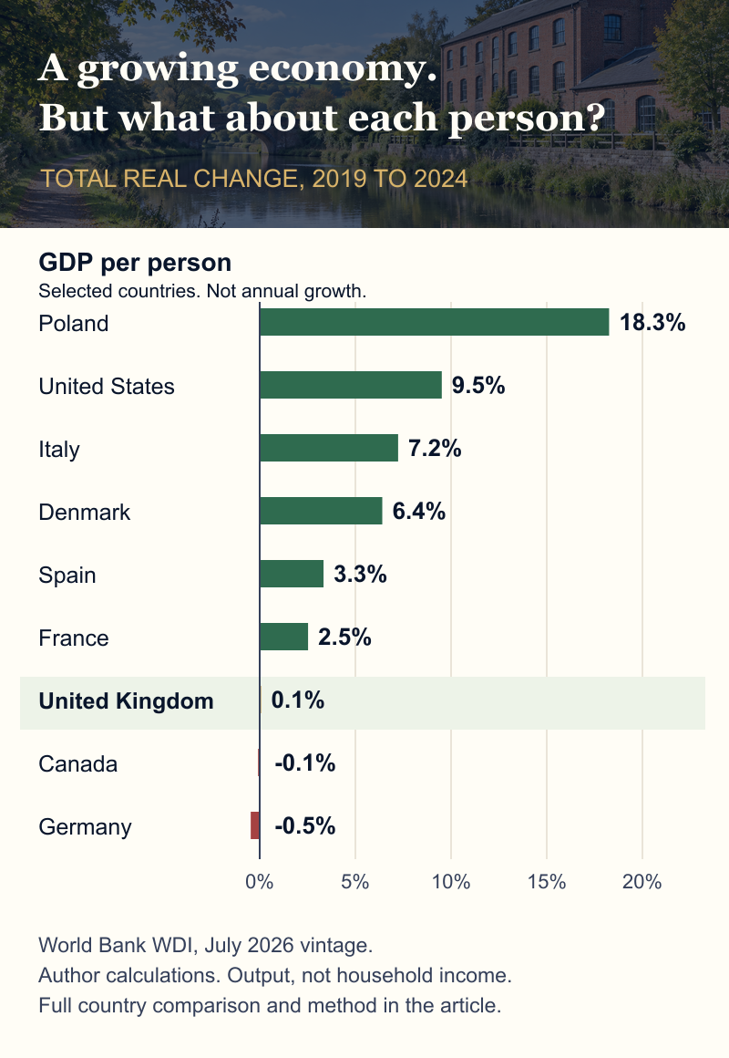
For Britain, a 4.1% bigger economy came with almost no increase per person. Canada shows an even sharper difference between the two measures. Japan and Italy show why a slow-growing whole economy need not have the same per-person story: changes in population affect the denominator.
That does not make population growth bad, or population decline good. It means the numerator and denominator both matter. The useful question is whether investment, housing, infrastructure and productive capacity keep pace.
And yes, Italy did better than Britain on this measure in this particular period. If a comparison surprises us, we should keep it, not quietly select a different period because it spoils our argument.
When did Britain's growth slow down?
To look further back, I calculated compounded annual growth in real GDP per person across two periods. Both stop before the pandemic. This is an endpoint calculation, not the arithmetic average of each year's growth.
| Country | 1990 to 2007 | 2007 to 2019 |
|---|---|---|
| United Kingdom | 2.4% | 0.5% |
| Germany | 1.5% | 1.1% |
| France | 1.5% | 0.5% |
| Italy | 1.3% | -0.5% |
| Spain | 2.1% | 0.3% |
| Netherlands | 2.2% | 0.7% |
| Poland | 3.9% | 3.8% |
| United States | 1.9% | 1.0% |
| South Korea | 5.6% | 2.7% |
Author calculations from the same WDI vintage. Annual compounded growth = 100 × ((end / start)1 / elapsed years - 1). Starting points matter, particularly for Poland's transition economy and Germany around reunification. These are descriptive windows, not a causal experiment.
Britain's slowdown is substantial. But it is not exclusively British: several peers also slowed. Germany did better than Britain between 2007 and 2019, even though its recent record is weaker. Countries do not keep the same position forever.
An important correction to the productivity story
GDP per person is not the same as output per hour. In September 2026, the ONS presented an improved productivity method which reduces the estimated post-financial-crisis slowdown. Its indicative component-method estimates put annual output-per-hour growth at about 2.0% in 1997 to 2007 and 1.3% in 2009 to 2019, rather than the older 2.1% and 0.7% comparison. The slowdown remains, but is less severe than previously measured. These are not yet the official headline quarterly series; the method is due to enter that bulletin in November. The change does not alter GDP itself. ONS explanation; method and indicative results.
We should not keep repeating an older number because it makes a better headline. Equally, a statistical revision does not itself build a house, improve a railway or increase your pay.
And what about Brexit?
The slowdown began before the 2016 referendum. Brexit therefore cannot explain all of it. That is not the same as saying Brexit had no cost.
The OBR's central assumption is that the post-Brexit trading relationship reduces long-run UK productivity by 4% relative to remaining in the EU. This is a modelled counterfactual level difference, not a measured 4% annual fall. The OBR also recognises how difficult it is to disentangle Brexit from the pandemic, the earlier productivity slowdown and energy shocks. OBR Brexit analysis.
My practical conclusion is to reduce avoidable trade friction. We do not need to pretend that Brexit explains everything, or nothing, to recognise that making it harder to buy and sell has consequences.
How do we compare with the rest of the world?
For the forward-looking comparison, I use one source and one release: the OECD's September 2026 interim outlook. Every figure in this table is a forecast of annual real GDP growth, not an observed result or a per-person forecast.
| Economy | 2026 forecast | 2027 forecast |
|---|---|---|
| India* | 7.1% | 6.5% |
| Indonesia | 5.2% | 5.1% |
| China | 4.5% | 4.2% |
| South Korea | 3.7% | 2.6% |
| World** | 2.9% | 3.0% |
| Spain | 2.6% | 1.8% |
| United States | 2.2% | 2.1% |
| Brazil | 2.0% | 1.9% |
| Australia | 1.9% | 1.7% |
| South Africa | 1.2% | 1.3% |
| United Kingdom | 1.1% | 1.0% |
| Germany | 1.1% | 1.1% |
| Euro area | 1.0% | 1.0% |
| Canada | 0.9% | 1.3% |
| Italy | 0.9% | 0.6% |
| Japan | 0.8% | 0.7% |
| France | 0.4% | 0.7% |
| Saudi Arabia | -1.8% | 4.1% |
Source: OECD interim outlook, Table 1, printed page 6, published 23 September; information available to 16 September. *India uses fiscal years starting in April: 2026-27 and 2027-28, not calendar years. **World growth uses moving GDP weights at PPP. It is not an average of the displayed countries. This is a selected table, not a complete global ranking.
Britain is not the weakest economy in this selection. But “some countries are worse” is a fairly limited national ambition.
The forecasts also reflect shocks, not just policy quality. The OECD identifies Middle East conflict and energy disruption as major uncertainties. Saudi Arabia's projected contraction followed by rebound illustrates why a growth table is not a simple scorecard of good and bad governments.
Faster growth does not automatically mean a richer country
A country starting with lower output per person can grow quickly while catching up. That is a real achievement, but Britain should not expect to reproduce another country's percentage simply by copying a policy.
| Economy | Comparative production level |
|---|---|
| United States | 142 |
| Denmark | 133 |
| Netherlands | 132 |
| Germany | 117 |
| Sweden | 117 |
| South Korea | 103 |
| France | 103 |
| United Kingdom | 100 |
| Italy | 100 |
| Spain | 91 |
| Poland | 85 |
| China | 45 |
| World | 40 |
Author calculation: 100 × country PPP GDP per person / UK PPP GDP per person. World Bank WDI, 2024 observations in constant 2021 international dollars, July 2026 vintage. Italy is marginally below the UK before rounding. These are production levels, not take-home pay, personal wealth or a complete wellbeing ranking.
Britain has much higher average output per person than the world aggregate. There are also prosperous peers with substantially higher levels. We can be a comparatively rich country and still be performing below what we should aim for.
One particular trap: Ireland
Ireland's GDP is heavily affected by multinational activity. Its statistics office therefore publishes modified gross national income, GNI*, and modified domestic demand to help examine the domestic economy. A spectacular GDP number does not mean Irish households became richer by that same percentage. CSO explanation and accounts.
That is why I have not used Ireland's headline GDP as a simple target for Britain. Compare the thing you actually want to improve.
Who is doing better, and what might we learn?
We cannot prove a national growth strategy by pointing at one successful country. Many things change together. But we can identify plausible mechanisms and ask whether Britain could make them work here.
Poland: build capability and connect it to markets
The World Bank attributes Poland's convergence to European integration, skills accumulation and a dynamic private sector participating in international supply chains. That is more useful than just saying “Poland grows faster”. Its newer partnership framework emphasises innovation, investment and jobs as the next stage, rather than assuming catch-up will continue automatically. World Bank diagnosis, 2024; 2026 partnership framework.
My lesson: skills need customers and supply chains to sell into. Training people is good. Connecting their capabilities to productive work is the point.
Spain: more than a tourism story
The IMF's March 2026 staff assessment points to employment and migration supporting demand, stronger investment, European recovery funds and growth in non-tourism services such as business and ICT services. It also warns about housing constraints and weak productivity. Spain's stronger growth is not proof that every underlying problem has disappeared. IMF staff assessment of Spain.
My lesson: expand useful capacity and exportable services, while making sure the housing and infrastructure can support the people doing the work.
The United States: help good businesses get bigger
An IMF staff analysis of Europe's productivity gap with the US highlights the difficulty European firms face in scaling up, including fragmented finance and barriers to reaching larger markets. That is a mechanism we can examine, not a reason to copy every American policy. IMF analysis of scale and productivity.
My lesson: a successful pilot is not the finish line. Businesses need finance, staff, infrastructure and access to customers to turn an invention into something that produces at scale.
Germany: even strong economies can get stuck
The IMF's February assessment of Germany identifies weak productivity and ageing as continuing constraints, and calls for effective investment and structural reform. Germany is not a permanent example of either success or failure. It is a reminder that yesterday's strengths need maintenance. IMF assessment of Germany.
My lesson: don't wait until the old model stops working before renewing the infrastructure, capabilities and business environment behind it.
What would I actually want Britain to do?
The OECD's July UK survey identifies weak productivity, regional gaps, energy costs and fiscal pressure as constraints. It recommends better regional connectivity and faster electricity-network investment, alongside fiscal discipline. That is a diagnosis and a set of recommendations, not proof that a particular spending programme will deliver a guaranteed return. OECD UK survey summary.
My priorities would be these. They are judgements drawn from the comparisons, not an economist's claim that one lever will fix the country.
| Priority | What “better” would mean |
|---|---|
| Make investment executable | Good projects connect to power, secure permissions and enter service, rather than remaining announcements. |
| Train people into real work | Employers, colleges and apprenticeships connect to an actual pipeline of skilled jobs. |
| Spread opportunity beyond a few places | Transport, homes and local capabilities let more people reach productive jobs. |
| Help firms scale and trade | More businesses turn useful products and services into sustained domestic and export revenue. |
| Use technology to improve the job | AI and automation reduce errors, waiting and unnecessary work, rather than just producing impressive demos. |
| Measure who benefits | Higher output per person is accompanied by improvements in household incomes, affordability and services. |
AI belongs in that picture, but it is not a substitute for the rest of it. A business which saves administrative time still needs customers. A faster planning analysis still needs an executable decision. A useful agent still needs reliable data, permission and someone accountable for what happens.
We should also ask what a project displaces, how it is paid for and whether the gains reach households. A growth strategy should survive those questions.
So, are we doing terribly?
Compared with our own potential, we are not doing well enough. Compared with every other country, we are not uniquely disastrous.
The latest figures show growth. The five-year per-person record shows why that is not enough. The international comparisons show that better outcomes are possible, but not that every country has found one magic answer.
Even household measures can move differently: the ONS reports real household disposable income per person rising 1.0% in Q2 2026 after falling 0.8% in Q1. That is useful context, not a declaration that every household now feels better off. ONS household income estimates.
I love this country. I don't think we need to talk ourselves into permanent decline. But “we are stable” is not enough either. Stable can mean a platform for progress. It can also mean we have become rather comfortable explaining why nothing much improves.
I would rather ask: what is stopping people here from producing more useful things, building good businesses and having a better life? Then remove those obstacles, and check whether the result actually improves.
That seems a better ambition than celebrating because somebody else had a worse quarter.
Sources and how I checked the comparison
- Recent results: ONS UK quarterly national accounts, released 30 September 2026, and Eurostat's Q2 release, 7 September 2026. Periods and growth concepts are matched; release vintages are stated.
- Historical growth: World Bank WDI real GDP and GDP per person, downloaded 4 October 2026, dataset updated 13 July 2026. One vintage is used throughout, with 2024 as the common endpoint. These figures are not silently joined to later UK revisions.
- Comparative levels: WDI GDP per person at PPP, constant 2021 international dollars, 2024 observations. Rebased to UK = 100. Exchange-rate GDP is not used as a household living-standard ranking.
- Forecasts: one OECD September 2026 release. India fiscal years and the world PPP weighting are explicitly identified. A forecast is not an outcome.
- Interpretation: ONS methodology, OBR counterfactual modelling, IMF country assessments and staff analysis, World Bank analysis, OECD recommendations and Irish CSO methodology. Their diagnoses are not controlled experiments proving a single cause.
- Limits: this is a production-and-growth comparison. It does not rank poverty, distribution, health, leisure, environmental quality or the performance of every country. Different starting dates, revisions and statistical methods can change the apparent order.
There is also a limit to the source mix: several organisations use the same underlying national accounts, so agreement is not independent confirmation. I have used primary statistical sources for the numbers and attributed policy analysis separately. These institutions have economic frameworks and policy preferences; their recommendations are arguments to examine, not neutral laws of nature.